
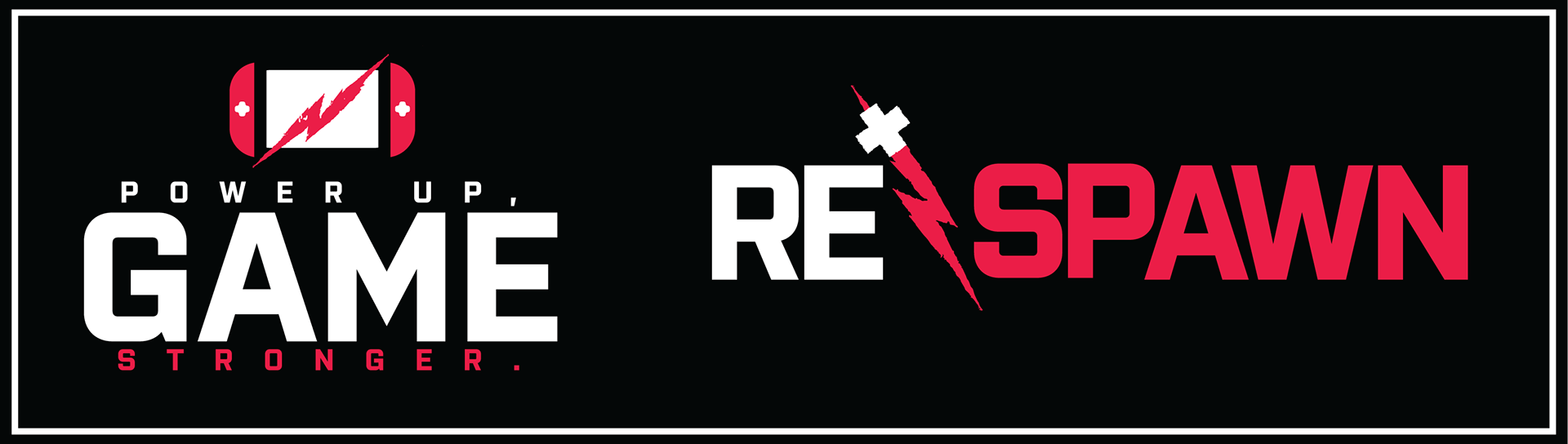
POWER UP,
GAME STRONGER.
Respawn is a brand focused on fueling gamers with high-protein, electrolyte-packed products that boost energy, focus, and endurance for intense gaming sessions. Tailored to gamers aged 18-34, especially those in competitive gaming and E-sports, Respawn's mission is to keep players sharp and energized throughout their longest battles.


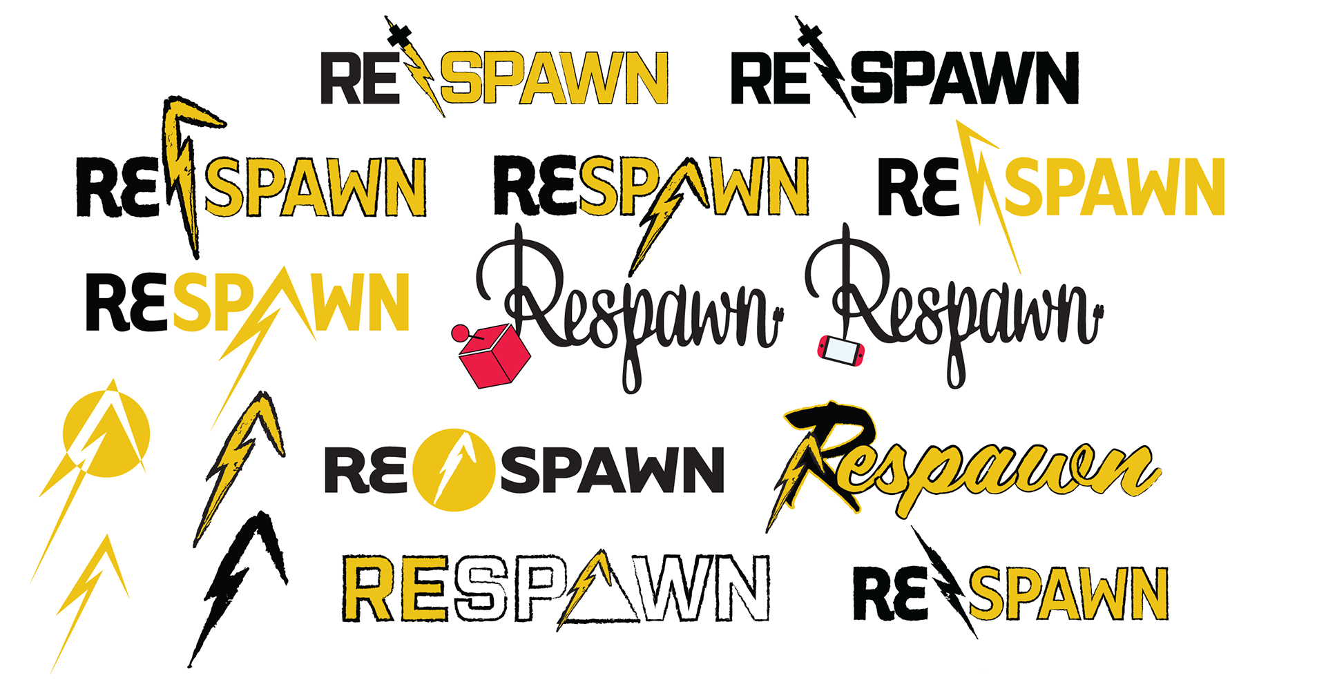
LOGO EVOLUTION
I initially envisioned a gritty, dual-tone logo in black and yellow, incorporating a lightning bolt merged with a plus symbol. The lightning bolt represented energy, while the plus symbol reflected health, a common icon in many video games. After exploring multiple versions, I eventually landed on a clean, single-color design with no stroke on the text, which better matched the sleek and modern direction of the brand.
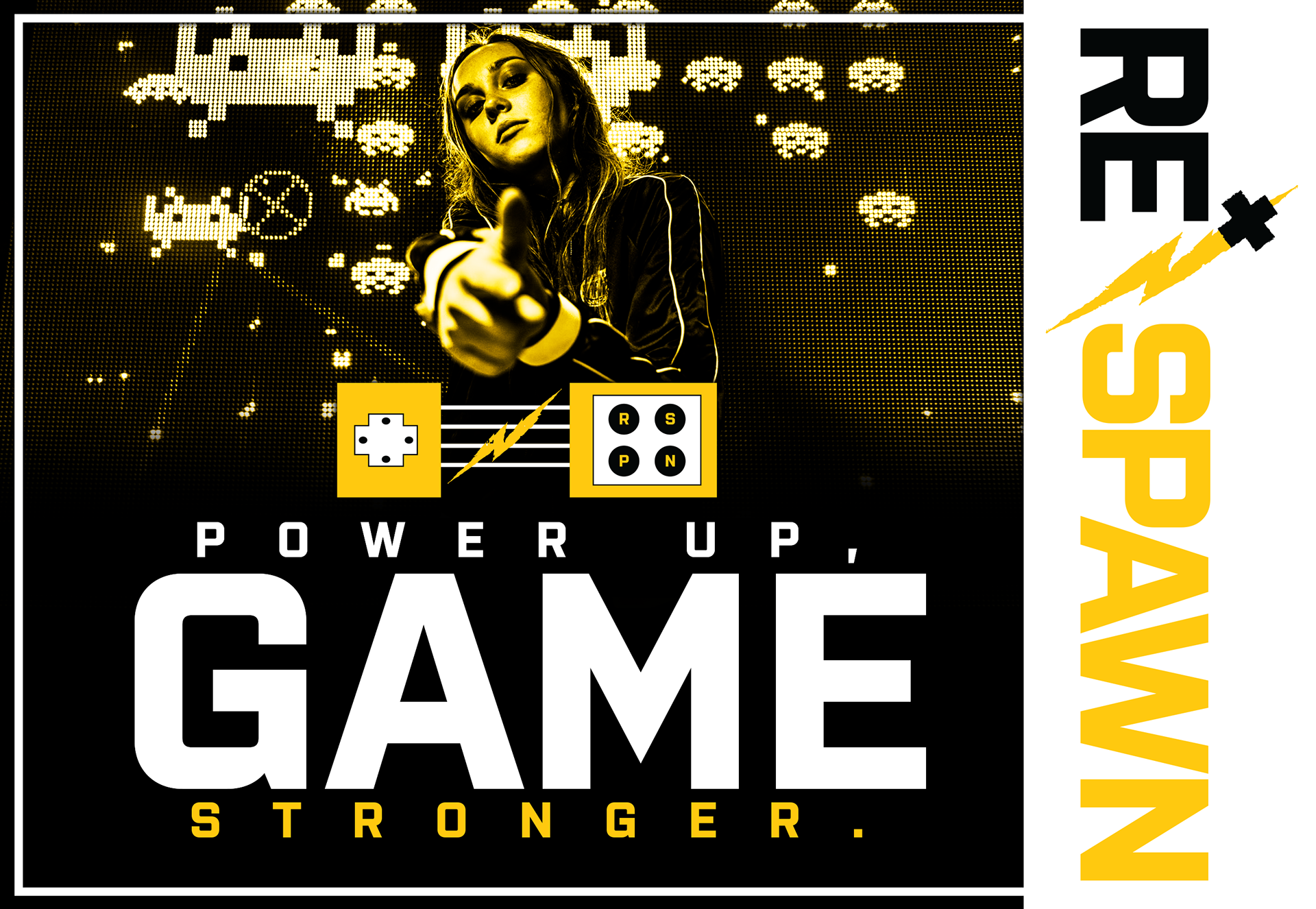
BRANDING &
ADVERTISING
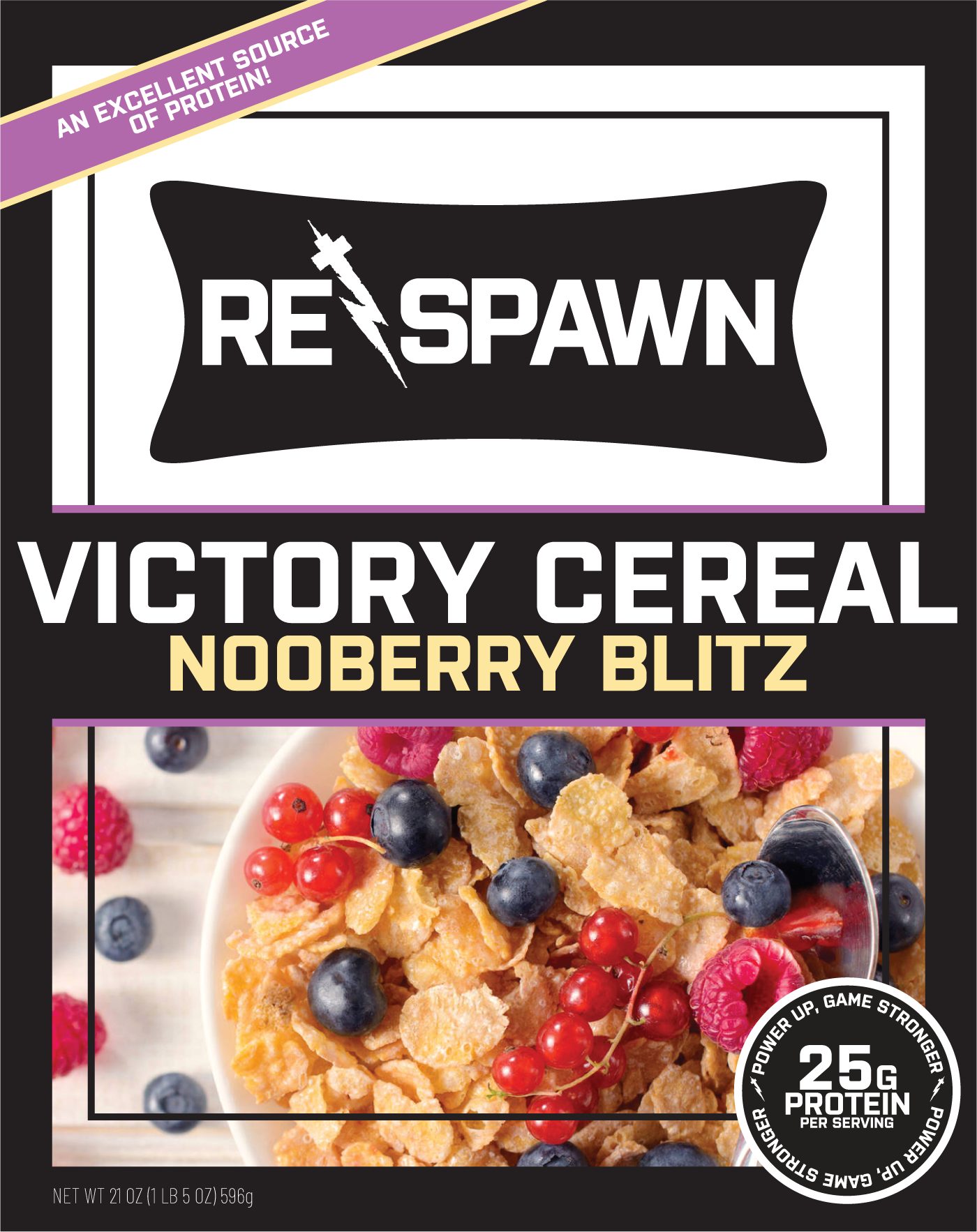
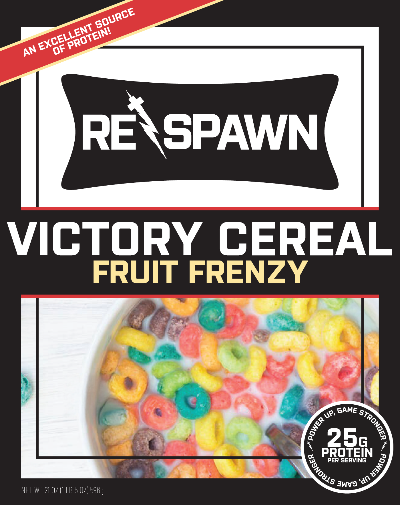
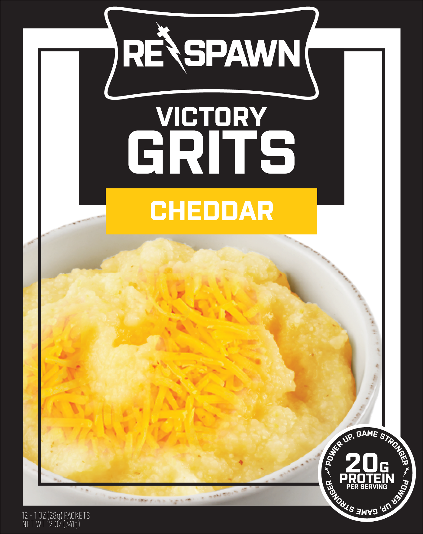
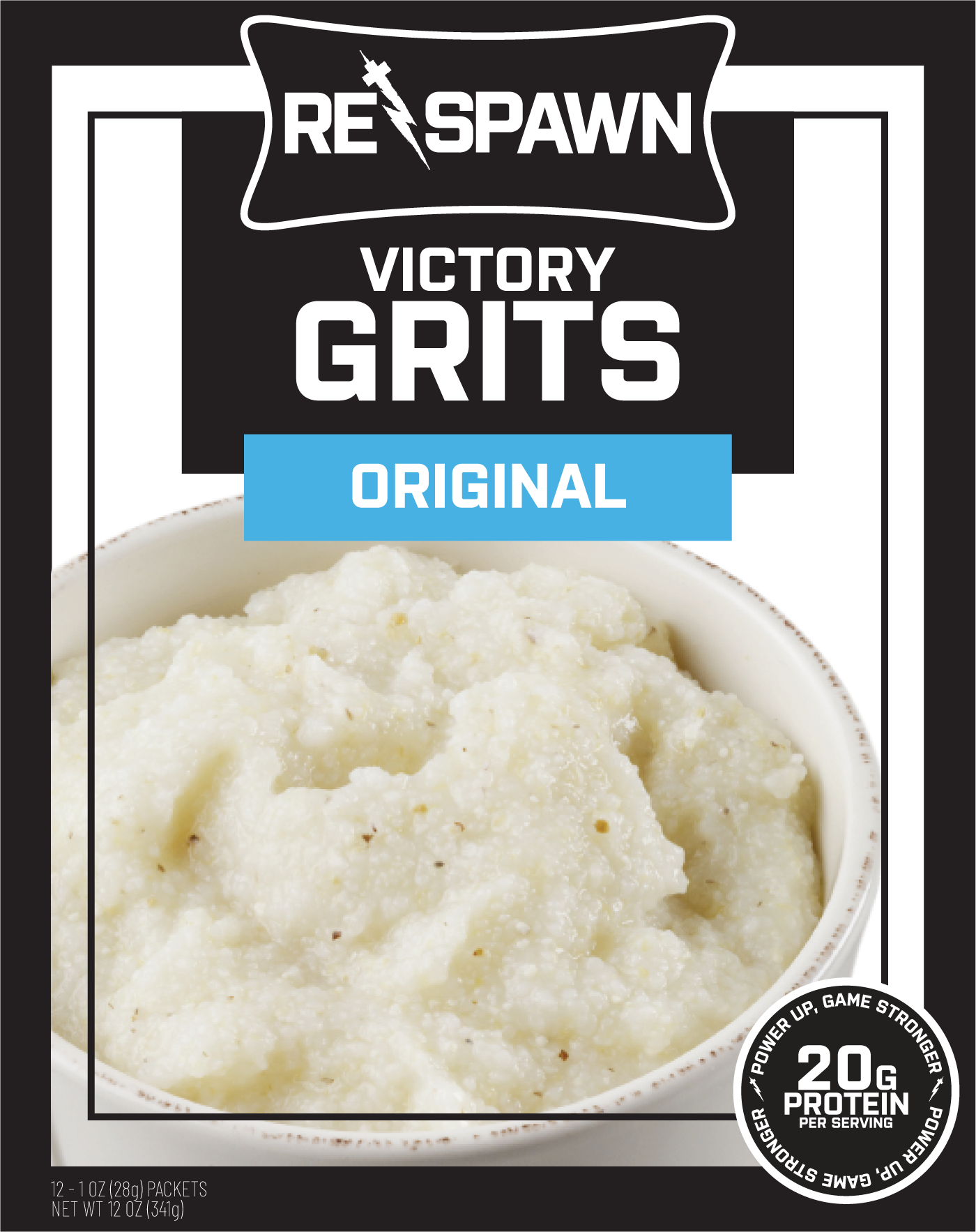
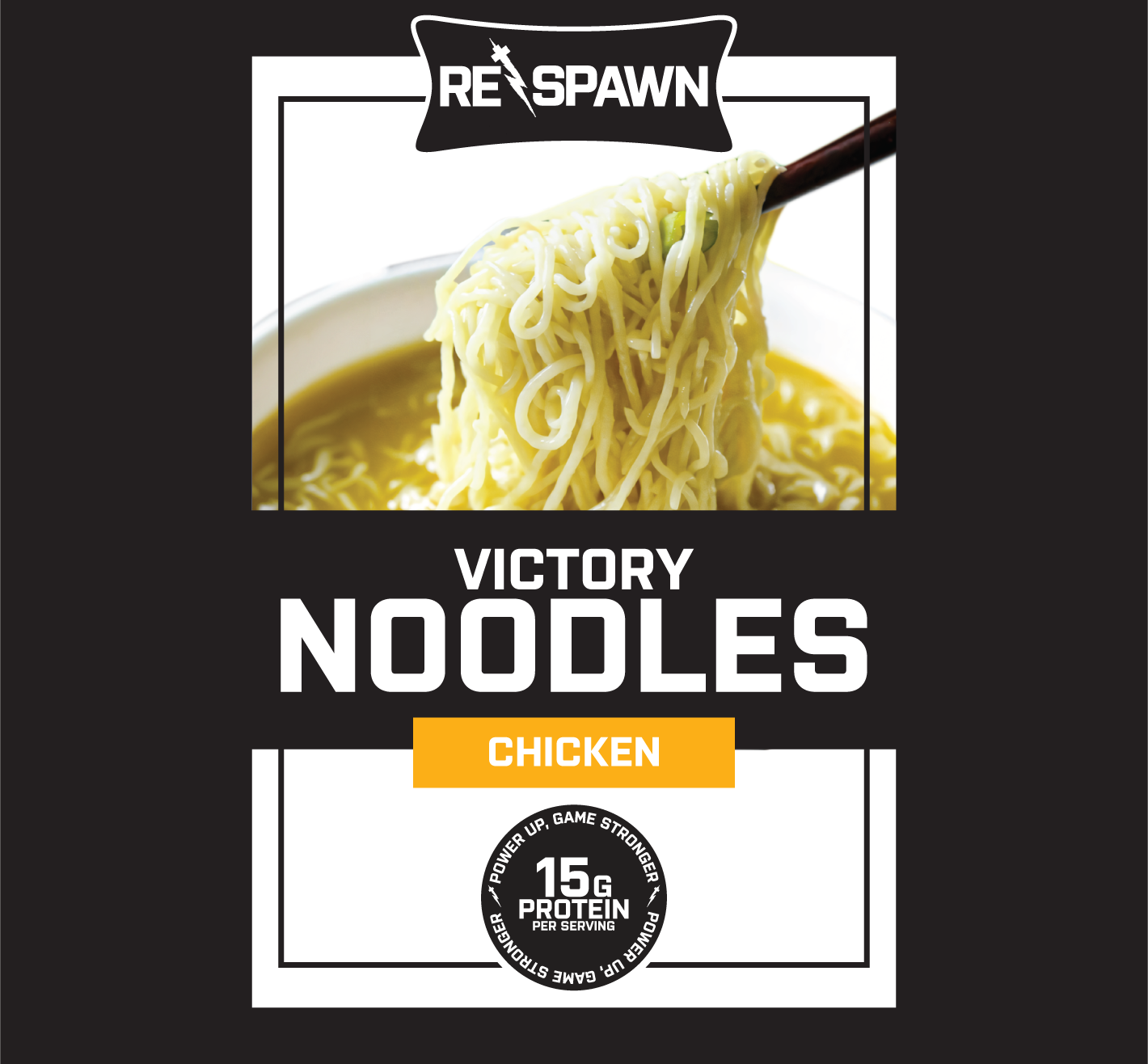
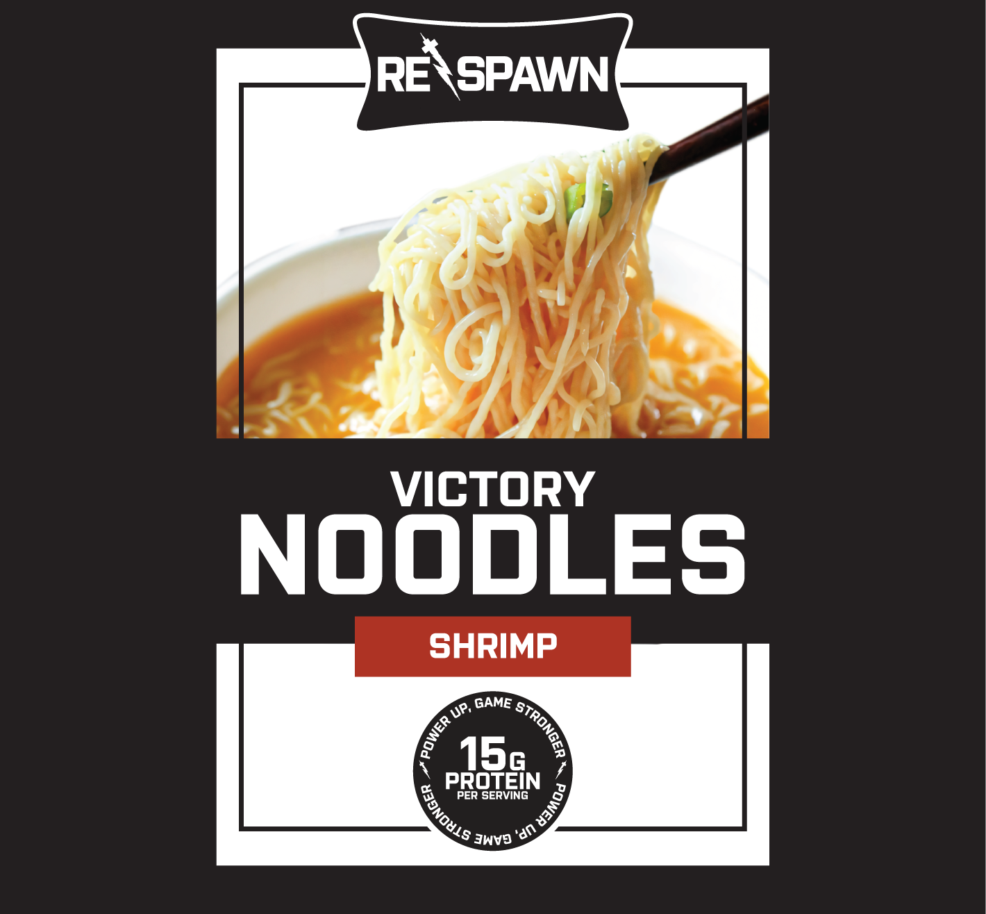
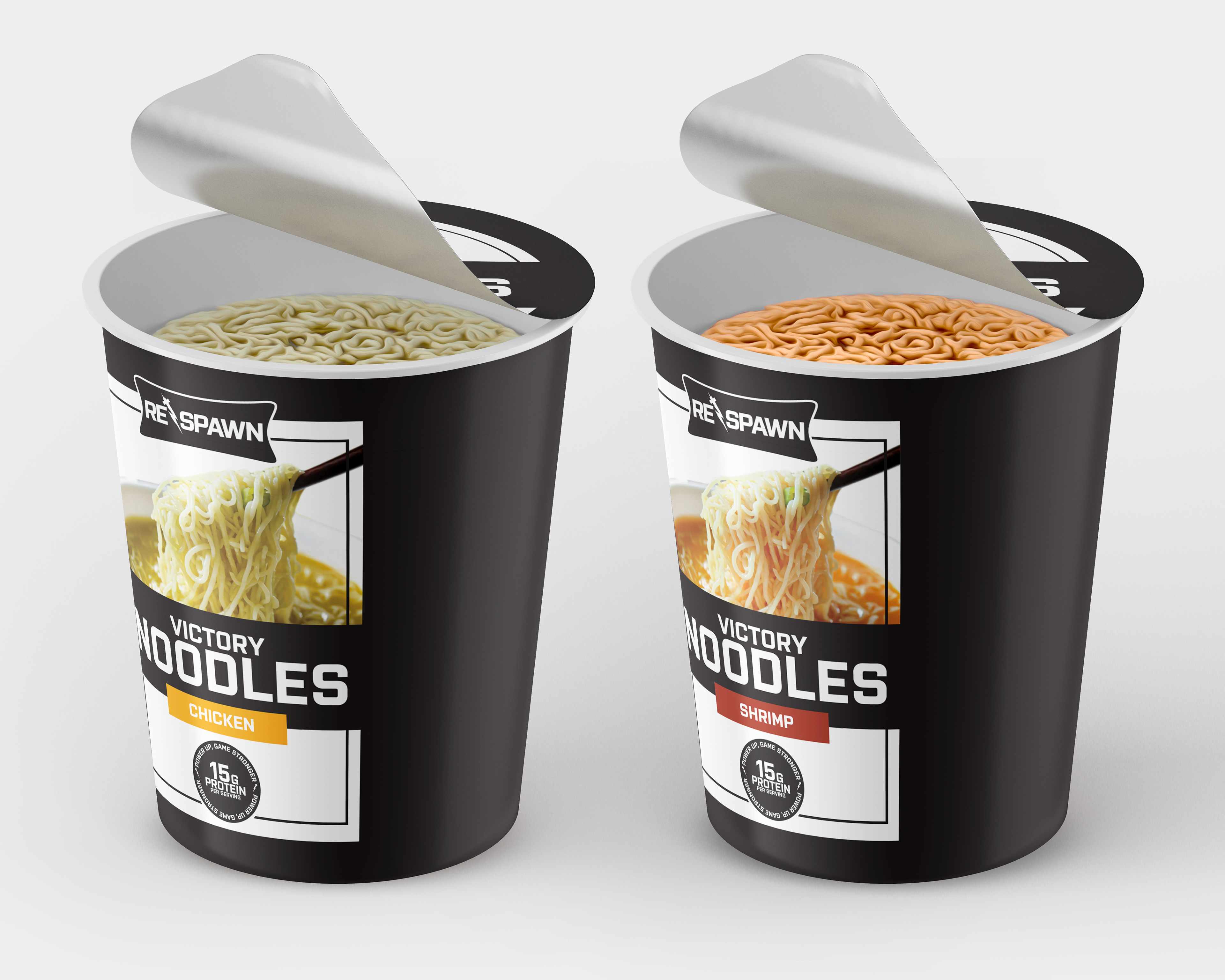
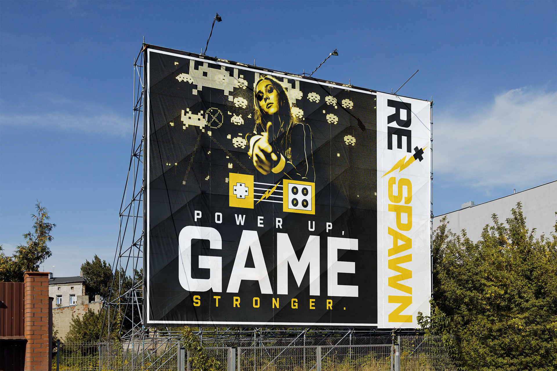
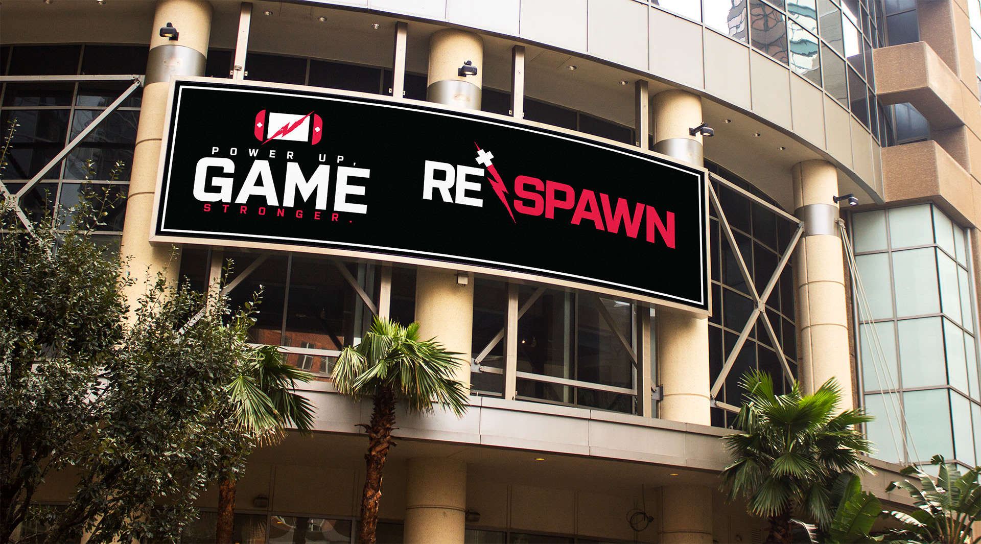
The Respawn product line includes Victory Cereal, Victory Grits, and Victory Noodles—each named after the victorious moments that resonate with gamers. I made sure each packaging design stayed consistent across the brand, with slight variations for each product. The ad campaigns, displayed on banners and curved billboards, highlight the tagline "Power Up, Game Stronger" and feature a minimalistic console icon, reinforcing Respawn’s connection to the gaming world.
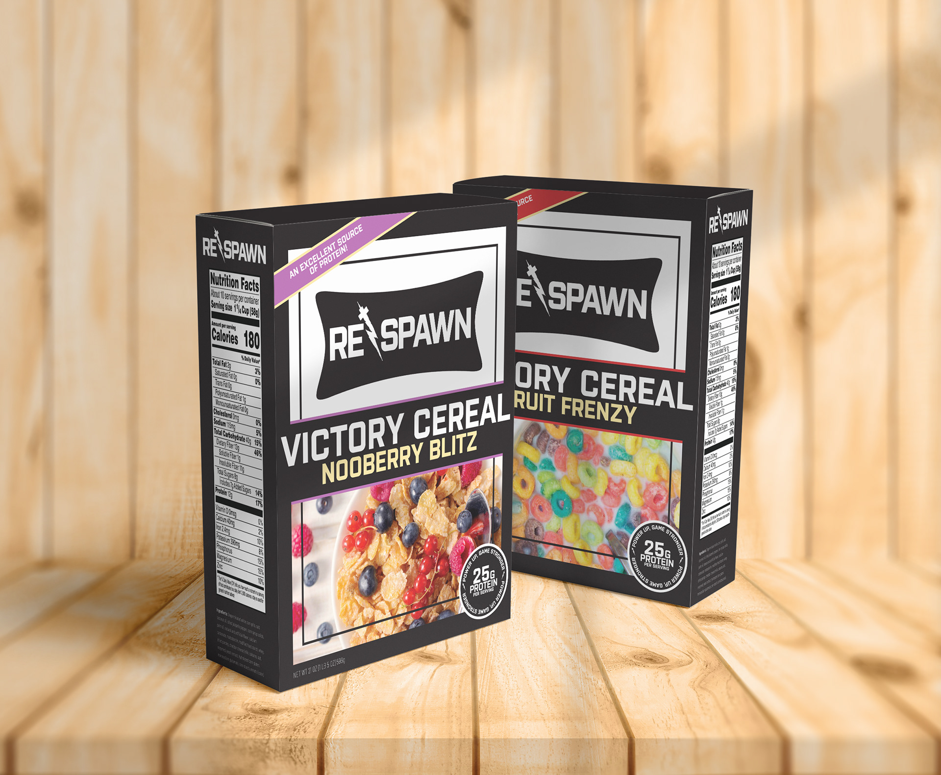
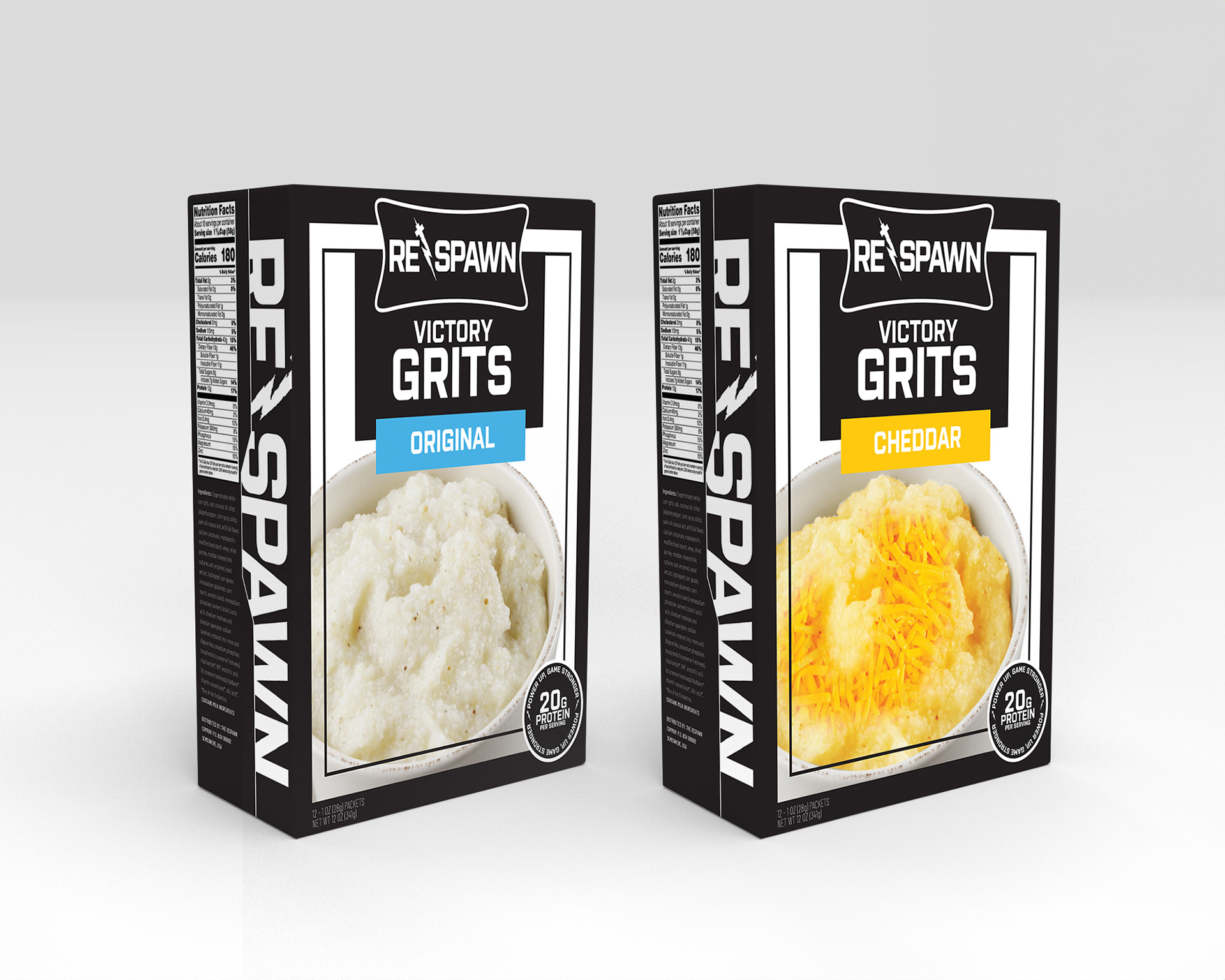
MOCKUPS
These mockups showcase the full range of Respawn’s products—Victory Cereal, Victory Grits, and Victory Noodles—alongside the advertising campaigns. Each design emphasizes the cohesive visual identity of the brand, tailored to reflect the needs and aesthetics of competitive gamers. From the different flavor options to the billboard layouts, every detail was carefully crafted to highlight Respawn’s focus on power and performance. The packaging, combined with the sleek advertising, helps convey the brand’s commitment to boosting gamers’ abilities both visually and nutritionally.


